2022 Week 1 — Accessibility Design, CSS Styles and Accessibility, Interactive Animated Background Library, console.assert()
Links worth sharing for web developers.
Hi there,
It’s the first week of 2022. Yes, according to ISO8601, this is the first week of 2022.
Here are the links worth sharing this week:
→ UI Design / The good, the bad and the toggle
https://www.alexbuenodesign.com/blog/the_good_the_bad_and_the_toogle
If the toggle is an action (Play/Pause) the label/title should show what will happen. If the toggle is an option (On/Off) then it should show the current state.
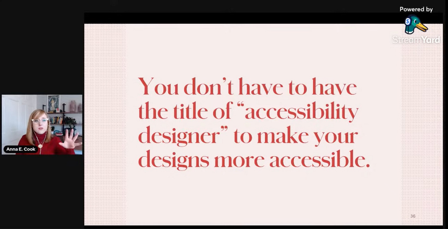
→ Accessibility / Why We Need More Accessibility Designers by Anna E. Cook
You don’t have to have the title of “accessibility designer” to make your designs more accessible.
→ Accessibility / Twitter needs manual language selection
https://hiddedevries.nl/en/blog/2021-12-30-twitter-needs-manual-language-selection
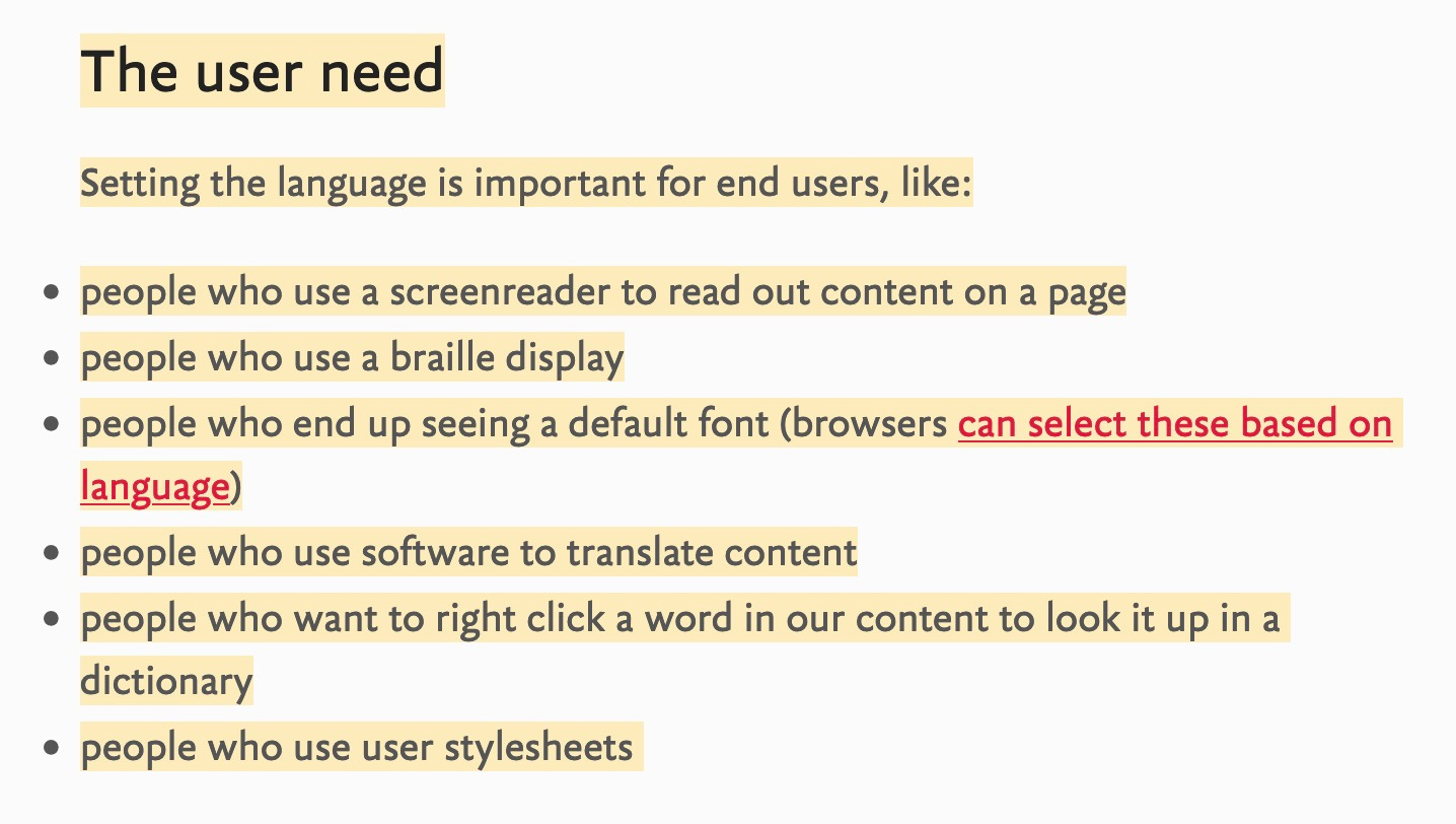
Setting the language is important for end users, like:
people who use a screenreader to read out content on a page
people who use a braille display
people who end up seeing a default font (browsers can select these based on language)
people who use software to translate content
people who want to right click a word in our content to look it up in a dictionary
people who use user stylesheets
For non-English tweets to meet WCAG, they need to have their language declared with a lang attribute. Twitter currently guesses languages, which is a great step in the right direction, but is likely of little help to speakers of minority languages. A manual selector would be a great way to complement the automation.
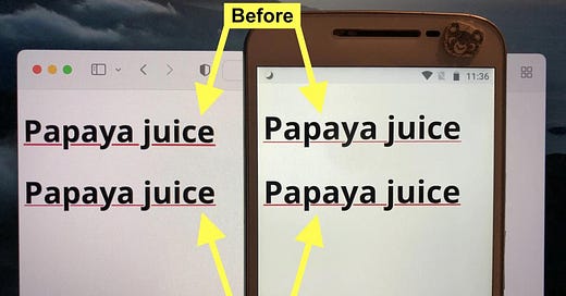
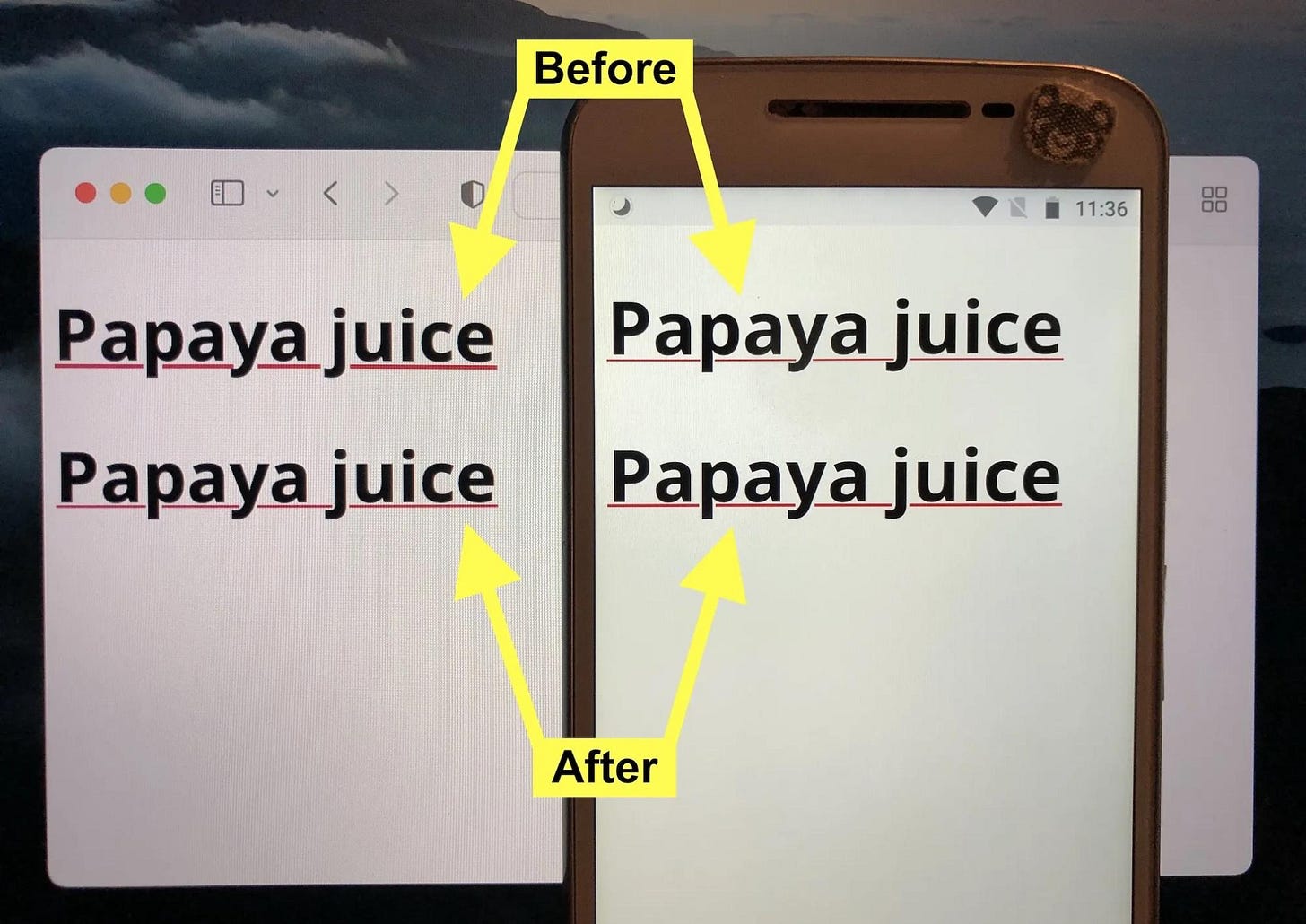
→ CSS and Accessibility / CSS Underlines Are Too Thin and Too Low in Chrome
https://css-tricks.com/css-underlines-are-too-thin-and-too-low-in-chrome/
Default underlines are inconsistent
→ CSS, Accessibility / Should CSS Override Default Browser Styles?
https://css-tricks.com/should-css-override-default-styles/
The lines are relatively fuzzy, but I’d say there is nothing in CSS that should be outright banned from use — it’s more about the styling choices you make. So when you do choose to style something, it remains usable and accessible. Heck, background-color can be terribly abused making for inaccessible and unusable areas of a site, but nobody raises pitchforks over that.
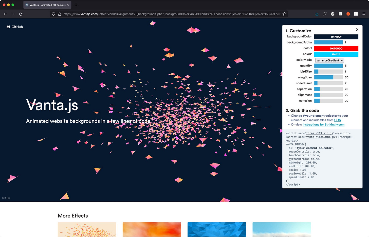
→ JS Lib / VantaJS
https://www.vantajs.com/
Animated and Interactive background via WebGL. Each effect can be further customized to fit the website’s style.
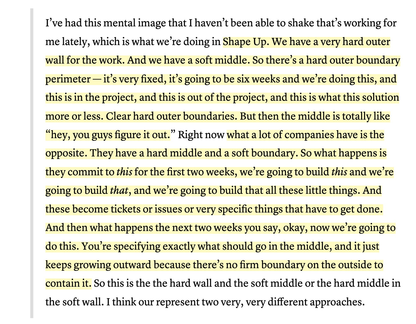
→ Product Development / Hard Edges, Soft Middle
https://www.colemanm.org/post/hard-edges-soft-middle/
By defining a hard boundary within 6 weeks, we trust the developers to come up with solutions.
This requires trust in the product team to choose approach trade-offs wisely. If you encounter a library in use for the feature that’s heavily out of date, but the version update requires sweeping changes throughout the app, you’ll need to pick your battles. A team with fixations on particular steps (the “hard middle”) might decide too early that an adjacent feature needs rework. Before pulling up to a higher altitude to look at the entire forest, the team’s already hitched to a particular step.
→ JS / console.assert
Use console.assert as a cheap-n-easy test function.
Quote of the week
“if an explanation can help that person start to care, the rest is much easier.”
— The Art of Explanation
Until next week,
Thomas Mak

