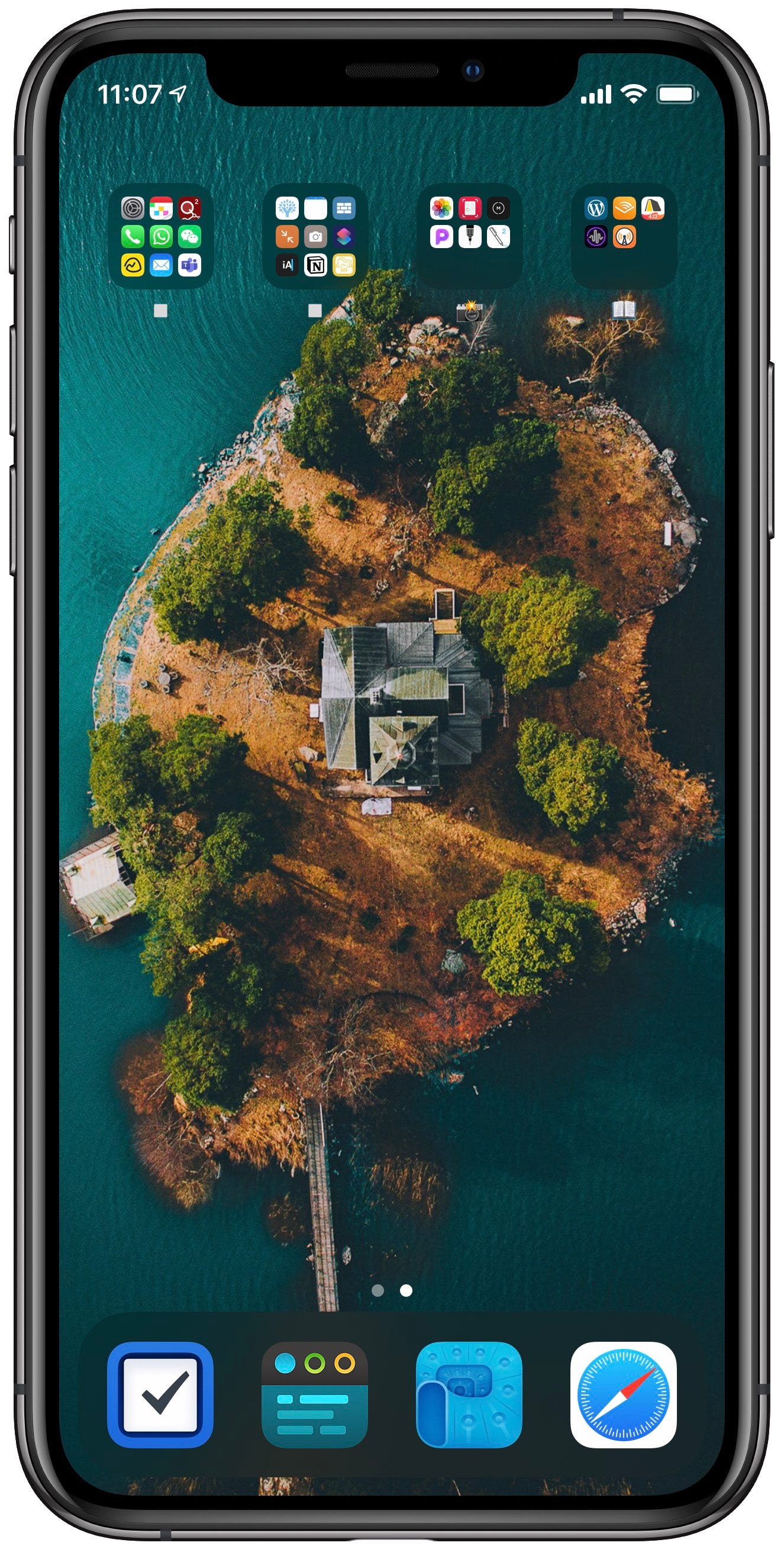
My minimal home screen setup
Makzan’s Dispatch 2020 week 17
Last week I shared how I use my phone in grayscale. I also review which apps I keep on my home screen frequently.

This is my current home screen. The wallpaper is from the WLPPR app. It is an island in Sweden.
My rule of thumb when setting up my home screen:
1 and only 1 page.
Most frequently apps in the dock. They are
Safari
Often used apps on the first page of folders in top rows. Some of them are Settings, Calendar, Communications, Photos, YNAB budgeting app. The four folders are categorized as:
Core apps
Aside apps
Photos related apps
Reading-related apps
Most notifications are either turned off or in notification center only. They are hidden in the lock screen, not popping up as banners, never produce sounds and no icon badges at all.
Now I have fewer chances to get distracted by apps. I control my phone and I only use it when I have a purpose to use it. Also, my home screen is grayscale most of the time, making it less attractive.
Links worth sharing
The JS for the upcoming Hey.com email services from Basecamp
This week I learned: git checkout is now two commands: git switch and git restore
My Beginning Python Programming textbook
https://makclass.com/n_courses/beginning-python-programming
Last week I finished lecture 2 and 3 of Beginning Python course. I’m trying a new approach that integrates interactive widgets into textbook. I am still in progress migrating the notes of the previous classes into this new format.
JAMStack Conf Virtual is opening for registration.
https://jamstackconf.com/
The events date will be May 27—28 and it is free.
How not to use the label element
https://shkspr.mobi/blog/2020/04/how-not-to-use-the-label-element/
A real-world example of not making use of label with checkbox.
Furthermore, sometimes we may hide the label text for aesthetic reason, W3.org provides several solutions.
https://www.w3.org/WAI/tutorials/forms/labels/#hiding-label-text
I thought title text improved accessibility. I was wrong
https://silktide.com/blog/2013/i-thought-title-text-improved-accessibility-i-was-wrong
By the way, we often think title improves accessibility but indeed it is usually the contrast.
The JS for the upcoming Hey.com email services from Basecamp
StimulusJS
https://stimulusjs.org/
Hey.com uses StimulusJS, also from Basecamp. It is more like a jQuery alternative instead of React/Vue alternative. It seems to be a fit with Turbolinks, where Turbolinks is top-down and StimulusJS is bottom-up. A good balance between these two is definitely an alternative against the modern JS web application approach.
This week I learned: git checkout is now two commands: git switch and git restore
https://stackoverflow.com/a/57266005/1382695
I had been using git checkout for both switching branch, creating branch, restoring files since 2009. I often thought that should be two commands for two purposes. So here they are: switch and restore.
Until next week,
Thomas Mak


